API Metrics for Fine-Tuned Models: What to Track
Track API metrics that matter for fine-tuned models—latency, throughput, error rate, token usage, cost per request, and task completion—to catch rollback risk.
A fine-tuned model is only worth keeping if it stays fast enough, stable enough, and cheap enough under live API traffic.
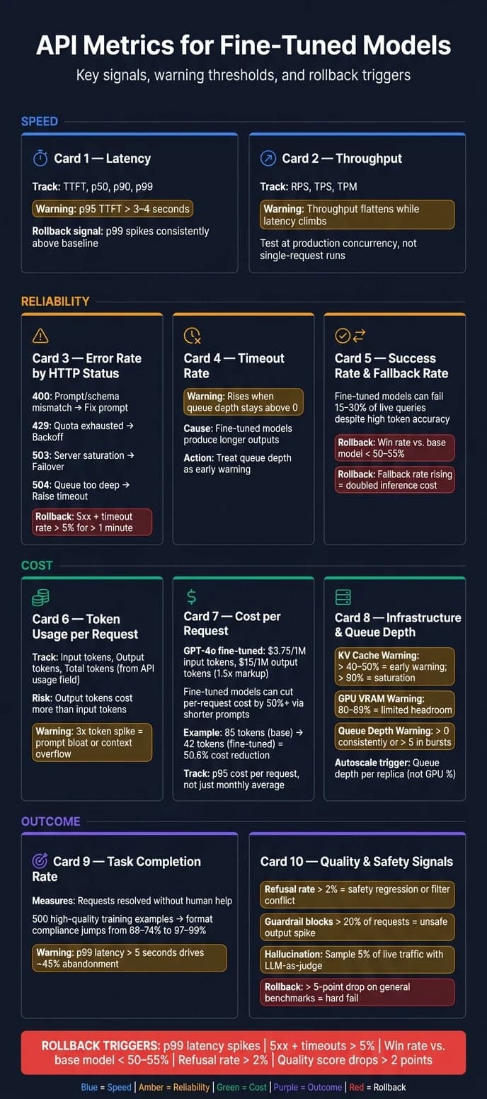
If I were tracking just a few things from day one, I’d watch latency, throughput, error rate, timeout rate, success rate, fallback rate, token usage, cost per request, queue depth, and task completion rate. Why? Because a model can return 200 OK and still fail the task, burn extra tokens, or push users to leave.
Here’s the short version:
- Latency: Watch TTFT and p95/p99, not just averages.
- Throughput: Test RPS/TPS under production concurrency, not one request at a time.
- Reliability: Split 4xx, 5xx, 429, 503, and 504 so failure patterns are easy to spot.
- Timeouts: Longer outputs often push fine-tuned models past request deadlines.
- Success vs. fallback: A working API response is not the same as a usable answer.
- Tokens: Track input, output, and total tokens from the API
usagefield. - Cost: Measure cost per request, cost per 1,000 tokens, and p95 cost, not just monthly spend.
- Capacity: Queue depth and KV cache pressure often show trouble before GPU charts do.
- User outcome: Watch task completion rate, human review, and abandonment.
- Rollback risk: If p99 spikes, 5xx + timeouts pass 5%, or win rate vs. the base model drops below 50%–55%, I’d treat that as a hard warning.
Fine tuning with Custom Compute Metrics
Quick comparison
| Metric | What I’d use it for | Common warning sign |
|---|---|---|
| End-to-end latency | See total response speed | p95 TTFT above 3–4 seconds |
| p50/p90/p99 latency | Find tail pain | p99 far above median |
| Throughput (RPS/TPS) | Check load capacity | Throughput flattens while latency climbs |
| Error rate by status | Spot request failures | Spike in 5xx, 503, or 504 |
| Timeout rate | Catch deadline misses | Timeouts rise with queue depth |
| Success rate | Check usable task completion | More schema or tool-call failures |
| Fallback rate | See how often backup models are used | Higher cost and lower trust in fine-tune |
| Token usage/request | Find token creep | Output tokens drift up over time |
| Cost/request | Tie usage to spend | p95 request cost jumps |
| Queue depth / capacity | Detect saturation | Queue stays above 0 or bursts past 5 |
| Task completion rate | Measure business outcome | More human review or abandonment |
Bottom line: I wouldn’t judge a fine-tuned model by offline scores alone. I’d compare it to the base model in production, set rollback limits before launch, and keep one dashboard that shows speed, failures, spend, and outcome in one view.
Why API Metrics Matter More After Fine-Tuning
Fine-tuning changes how a model behaves in production. Under live traffic, latency, token use, and failure patterns can all move around. In some cases, fine-tuning cuts input tokens by replacing long prompts. In others, it pushes output costs up by making completions longer [6]. That’s why offline wins don’t mean much on their own. You have to check them against live API metrics.
The gap between offline testing and production is real. Research shows that a fine-tuned model can gain 12 points on a task-specific holdout set and still lose 6 points on general reasoning benchmarks like GSM8K [2]. That’s not some odd corner case. It’s a known failure pattern called catastrophic forgetting, where improving one skill can weaken others.
The lesson here is pretty simple: a fine-tune can help the task you care about and still hurt performance elsewhere. And that kind of benchmark drift doesn’t show up clearly if you only stare at offline scores. You see it when production signals sit next to eval results.
Quality drift isn’t the only problem. Domain fine-tuning can also weaken base-model refusal behavior, which makes the model more open to jailbreaks and prompt injection [2]. In production, that kind of slip shows up fast: success rate falls, fallback rate goes up, and error spikes start to appear in ways a static test set won’t catch. Those changes show up in the API metrics that follow.
1. End-to-End Latency
End-to-end latency is the total time from when a client sends a request to when the full response arrives. That includes network time, queueing, inference, and response delivery [7][9]. For fine-tuned endpoints, this is one of the first production signals to watch.
A simple way to think about latency is this: total time ≈ TTFT + output_tokens × TPOT [9].
TTFT measures how fast the first token shows up, which matters a lot for streaming apps [9][10]. TPOT is the average time between generated tokens [9]. This split helps you see what changed after a fine-tune. Did response speed slip? Did streaming start later? Did token generation slow down?
Fine-tuned models often run 10%–20% slower than base models. If latency jumps by more than 50%, that usually points to unmerged LoRA weights, missing quantization, or output that has gotten too long [7][8]. The useful comparison is against the base model. That tells you whether the fine-tune improved task quality enough to justify the speed hit.
Tail latency is what users notice during slow turns, retries, and queue spikes. A p95 TTFT above 3–4 seconds creates a clear slowdown for users [3]. In interactive chat, p95 TTFT under 500 ms feels instant. Once it moves past 3–4 seconds, the experience drops off fast [12]. So don’t set SLAs on the mean alone. Set them on tail latency.
High tail latency usually points to queue depth problems or cold-start overhead, not raw GPU speed [10]. That’s why percentile latency matters more than average response time by itself.
Before you measure, run 2–3 warm-up requests. First-call latency is often 30%–50% higher [8].
2. p50, p90, and p99 Latency
Average latency can make things look better than they are. You might see a mean response time of 1.2 seconds and assume the endpoint is doing fine, while the p99 is 9 seconds [15]. That means 1% of users are still waiting almost 10 seconds, even though the dashboard says everything looks normal. Percentiles help you see whether the fine-tune helped most requests or just pushed the slowdown into the tail.
Here’s what each percentile tells you about your fine-tuned endpoint:
| Percentile | What It Measures | Why It Matters |
|---|---|---|
| p50 (Median) | Typical request speed | What most users feel on a normal day [9] |
| p90 | Upper-normal request speed | Shows the broader user experience beyond the median [14][15] |
| p99 (Tail) | Worst 1% of requests | The tail that drives rollback risk [13][16] |
Use these percentiles to compare the base model and the fine-tuned model under the same traffic mix.
After fine-tuning, p50 and p99 can move in different directions. If your fine-tune leads to shorter, more structured outputs, p50 may drop because typical requests finish faster. But p99 may climb if the model sometimes gets more verbose [7][15]. That split matters. If p99 rises while p50 stays flat, that’s the signal to dig in, not the average response time.
p99 is your rollback-risk number. Set regression gates in your CI/CD pipeline around p99 thresholds [15]. If a model update pushes tail latency past your limit, the build should fail before it hits production.
Latency tells you how slow requests feel. Next, look at how many requests the endpoint can handle.
3. Throughput and Requests Per Second (RPS)
Latency tells you how one request performs. Throughput tells you how much work the endpoint can handle over time.
The main numbers to track are Requests Per Second (RPS), Tokens Per Second (TPS), and Tokens Per Minute (TPM) [17][18]. Together, they show whether your fine-tuned endpoint can keep up with actual traffic, especially when using a unified LLM API to manage multiple providers.
Here’s the catch: a model can look fast in a one-off test and still fall apart once traffic stacks up. Under concurrency, you can hit throughput collapse, where adding more parallel requests no longer increases output, and latency starts to spike hard. That inflection point - where throughput stops scaling - is your capacity ceiling [15].
One of the biggest factors behind RPS is output length. If a fine-tune starts giving longer answers, throughput goes down and costs go up, even if the replies are better [6][8].
It also helps to watch goodput, not just raw throughput. Goodput is the share of requests that still meet latency SLOs. If goodput is low, the endpoint may be busy but still missing the mark. That kind of gap often points to weak batching or server saturation [17].
So when you benchmark RPS and TPS, test at production concurrency, not with single-request runs. Limits tied to rate caps, queue depth, and VRAM often stay hidden until the system is under load [7][9][15]. If the endpoint can hold capacity there, then it’s time to check whether those requests are succeeding.
4. Error Rate by HTTP Status Code
Once load is under control, the next thing to watch is reliability: how often the endpoint fails. Error rate tells you whether requests finish the way they should. In practice, this breaks into two buckets: client-side failures and server-side failures.
A rise in 4xx errors often points to prompt or schema mismatches, or context-window issues introduced by the fine-tune. A rise in 503 or 504 errors usually points to server strain or timeout pressure. When 5xx errors spike, treat that as a serious rollback risk.
There’s also a money angle here. Failed requests still consume tokens. To track wasted spend, add up token charges from failed requests, especially 4xx errors other than 429 and any 5xx errors [22]. And if retry logic is too aggressive, those bad retries can push inference cost up by 3x to 5x [21].
Here’s a simple map of the most common status codes, where they usually come from, and what to do next:
| Status Code | Likely Failure Source | Recommended Action |
|---|---|---|
| 400 | Prompt/schema mismatches or context-window overflow | Fix the prompt or JSON schema [3] |
| 401 / 403 | Expired or invalid API key, or insufficient permissions | Rotate credentials or check access [3][21] |
| 429 | TPM/RPM quota exhausted | Back off and alert near 70% quota use [3] |
| 503 | Server saturation or provider outage | Pause and retry later or fail over [21] |
| 504 | Inference queue too deep or generation too slow | Raise the timeout for long generations [21] |
Don’t use the same retry logic for every error code. Retrying a 400 just burns more compute because the request is still broken. Exponential backoff belongs on 429 errors [21]. If 503s or 504s keep showing up across three checks, trigger a circuit breaker and route traffic to the baseline model.
Next, check whether slow responses are timing out before they finish.
5. Timeout Rate
When errors go up and there’s no clear jump in outright failures, timeout rate is the next thing to check. A timeout is still a failed request: the client gets no response before the deadline. Track timeout rate as the share of requests that pass that deadline, which often shows up as server-side timeout errors.
Fine-tuned models are more likely to hit timeouts because they often produce longer outputs. If the training data leaned wordy, the model may generate more tokens per request than the base model did. This is common when using Alibaba Qwen models or other high-performance LLMs that prioritize detailed responses. More tokens mean more generation time, and that extra time is what pushes requests past the deadline [8].
If queue depth stays above zero, the system is already at capacity. When that happens, timeout rates usually climb soon after [12]. Treat queue depth as the early warning sign instead of waiting for timeouts to show up. If queue depth rises at the same time as timeouts, you’re looking at a capacity problem, and it needs action right away. Once timeout rate settles down, separate true successes from fallback responses.
6. Success Rate and Fallback Rate
Even when timeouts go away, requests can still miss the job. Success rate tells you whether the model actually completed the task, not just whether it returned HTTP 200. That means checking things like schema compliance, correct tool calls, and factual accuracy. A fine-tuned model can post high token accuracy and still fail 15%–30% of live production queries because of task-level regressions [23].
Fallback rate tells you how often traffic had to be sent somewhere else after the fine-tuned endpoint failed, timed out, or got blocked by safety filters [4][5]. That’s why it should be tracked right next to success rate. You’re not just measuring completions. You’re measuring output you can use.
Use these two metrics together as the main signal for completion quality. If either one slips, that’s the moment to check whether the fine-tune still holds up against the base model. If win rate versus the base model drops below 50%–55%, that’s a common rollback threshold [2][4].
If success stays high but cost starts climbing, check token usage next.
| Metric | What It Signals | Rollback Risk Level |
|---|---|---|
| Success Rate (Schema/Task) | Format drift or quantization errors | High - breaks integrations |
| Fallback Rate | Fine-tune is less reliable than the base model | High - doubles inference cost |
| Win Rate vs. Base Model | Fine-tune is worse overall than the base model | Critical - immediate rollback signal |
High success doesn’t mean much if every request costs too much to serve.
7. Token Usage per Request
After reliability, token usage tells you whether the model is lean enough to run at scale. It also shows whether fine-tuning is doing its job by replacing prompt overhead with learned behavior. Lower token usage usually means lower cost and faster replies.
Track input, output, and total tokens as separate numbers. That makes it easier to spot slow growth before it turns into a cost problem. High input tokens often point to prompt bloat or context overflow. High output tokens usually mean long-winded completions, weak stop rules, or no output cap. And output tokens cost more than input tokens, so verbosity is the biggest cost risk [15].
Pull token counts from the API usage object on every response, not from a local tokenizer estimate [15][25]. Local estimates can drift from billed counts. If you see a 3x token spike, assume prompt bloat or context overflow until you find the cause [3]. It also helps to set an output token cap in CI/CD so you can catch verbosity regressions before they ship [15].
Token counts map straight to spend, which is why the next metric is cost per request.
| Token Type | Primary Driver | Main Impact |
|---|---|---|
| Input Tokens | Prompt size, RAG context, tool schemas | Baseline cost, Time to First Token |
| Output Tokens | Response length, reasoning steps | Largest cost driver |
| Cache-Read Tokens | Stable system prompts, repeated context | Cost reduction |
| Context Window Usage | History length, retrieval chunk size | Overflow risk, reliability |
8. Cost per Request and Cost per 1,000 Tokens
Tokens turn into dollars. But a monthly bill by itself doesn't tell you why spend went up. To see what's driving it, track cost per request and cost per 1,000 tokens. That gives you the next layer of production analysis.
Cost per request shows what a single user action costs. Calculate it from billed input, output, and cached-token charges for that request [26][28]. Then track the billed rate per 1,000 tokens on its own. When you watch both numbers together, you can tell whether spend is climbing because you have more traffic or because prompts and completions are getting longer. That pattern is often called token creep [15][26].
Fine-tuned inference can cost 2x–5x more per token, but it can still lower cost per request when it cuts prompt length [29][30]. Why? A fine-tuned model bakes role definitions, guardrails, and few-shot examples into its weights. So each prompt gets shorter on every call. In one benchmark, a fine-tuned model needed only 42 completion tokens where the base model needed 85 - a 50.6% reduction in per-request inference cost [19]. In plain English, the higher unit price can lose to the lower token count. That’s the gain you want to measure in live API traffic.
Tag every API call with feature_name and user_tier so you can connect spend to product usage [27][28]. That makes the data far more useful when costs start drifting.
A few checks matter most:
- Watch output tokens closely. At flagship model pricing, they can cost 5x more than input tokens, so cutting a wordy answer saves more than cutting the same number of prompt tokens [15].
- Set a ceiling on mean output tokens in your CI/CD pipeline. This helps catch verbosity regressions before they hit production [15].
- Review cost by feature and user tier, not just in aggregate. Otherwise, expensive usage can hide inside a healthy-looking total.
After cost, look at whether spend matches real demand or just idle capacity.
Next, compare these costs with infrastructure utilization and queue length.
9. Infrastructure Utilization and Queue Length
If latency and timeouts went up, look at the serving layer next: queues, memory, and cache pressure. Queue depth matters most here. GPU utilization tends to trail demand, so it’s a lagging signal. That’s why autoscaling should key off queue depth per replica, not compute percentage [10][32].
KV cache usage is another metric teams often miss. The KV cache stores token context in GPU memory, and when that memory gets tight, the engine may start queueing new requests even if GPU compute still looks open [31][32]. A good rule of thumb: treat 40%–50% KV cache use as an early warning, and 90%+ as saturation [31][32].
Fine-tuned models add one more twist. LoRA adapters need memory on top of the base model weights, and loading them on the first request after a scale-up creates cold-start delay. In most cases, that adds a few hundred milliseconds to TTFT [10]. Preloading adapters at startup avoids most of that hit. It also helps to watch CPU on its own, since tokenization and preprocessing can add latency that’s easy to miss [10].
| Metric | Bottleneck Threshold | What It Signals |
|---|---|---|
| Queue Depth | > 0 consistently, or > 5 in bursts | Leading indicator of p99 latency spikes and capacity strain [10][12] |
| KV Cache Usage | > 90% | Saturation point; imminent timeouts [32] |
| GPU Memory (VRAM) | 80%–89% | Limited headroom for added adapters or larger batches; a sudden drop can signal a model crash or unloaded adapter [31] |
If these capacity signals still look healthy, move on to output quality.
10. User Satisfaction and Task Completion Rate
After latency, cost, and reliability, the last check is simple: does the model finish the job? A fine-tuned endpoint can be fast, cheap, and stable, yet still miss the mark.
Task Completion Rate (TCR) is the share of requests solved without human help. Human review rate is the share of outputs that still need manual fixes. That difference matters. A model can return HTTP 200 and still hand back something a person has to clean up before anyone can use it. So TCR tracks the business result, not just whether the API answered.
On structured-output work, 500 high-quality examples can push format compliance from 68%–74% to 97%–99% [33]. That kind of jump cuts down how often staff need to step in. Once the format is correct, compare the fine-tuned model directly against the base model.
Speed still matters here. P99 latency above 5 seconds drives roughly 45% abandonment [33]. So if the fine-tune slows the experience, users will show you fast - by leaving.
For a direct quality check, use paired arena testing. Run 200–500 production samples through both the base and fine-tuned models, then score the outputs side by side with an LLM-as-a-judge. After that, pin the judge model and rubric so future tests stay consistent. If win rate against the base model drops below 50%–55%, that's a common rollback threshold [2][4].
It also helps to watch these signals together:
- TCR
- Arena win rate
- A frozen benchmark suite
If the model drops by more than 5 points on general benchmarks, treat that as a hard fail, even when task-specific scores go up [2].
Use these quality checks next to the API metrics from earlier sections when deciding if the fine-tune is ready for production.
Latency and Throughput Comparison Table
No single metric tells the whole story for a fine-tuned endpoint. Average latency, for example, can smooth over request-to-request swings, especially when provider-side queueing and batching get involved [9].
That’s why it helps to measure latency and throughput on their own first, then compare them side by side before you set SLOs.
| Metric | What It Measures | Why It Matters for Fine-Tuned Models | Main Limitation |
|---|---|---|---|
| End-to-End Latency | Total time from request submission to final token arrives [20] | Surfaces hidden bottlenecks like tokenization and network hops [14] | Doesn’t show whether the delay came from prompt processing (prefill) or token generation (decode) [9] |
| p50 / p90 / p99 Latency | Response time at the 50th, 90th, and 99th percentiles across all requests [34] | Shows whether the fine-tune helped typical requests or just pushed pain into the tail | Small samples can still miss cold-start spikes [8][34] |
| Throughput (RPS / TPS) | Requests per second or tokens per second processed by the system [20] | Shows system capacity under load [14] | Strong throughput can still mask slow single-request performance [34] |
Break results out by endpoint type, model version, region, and time of day. Peak-hour traffic often brings latency issues to the surface that off-peak tests won’t catch.
Those cuts make it much easier to see where a fine-tuned endpoint starts to struggle under live traffic.
Reliability Metrics That Signal Rollback Risk
The clearest sign that a rollback may be needed is win rate versus the base model. Run paired canaries and shadow routing so you can compare the fine-tuned model against the base model side by side. If win rate drops below 50%, the fine-tune is no longer adding value in production. Your routing layer should also auto-rollback when the canary cohort holds a 2-point drop in any per-rubric quality score for 30–60 minutes [2][4]. Once those comparisons turn negative, the next move is simple: find the prompt groups that are breaking.
A few other signals should act as rollback triggers: 5xx + timeout rate, refusal rate, invalid-output rate, 429 spikes, and fallback behavior. These are the numbers that matter when you're deciding whether the fine-tune should stay live. Track 429 spikes on their own. They often point to higher compute cost or deeper queues [24][5].
It also helps to separate refusal rate from invalid-output rate instead of lumping them together. Refusals above 2% often point to a safety regression or provider filters clashing with your custom prompts [5][35]. Invalid-output rate usually points to schema drift or weaker instruction following [2][24].
Break each metric down by prompt type, workflow route, and model version. A model can look fine on general requests and still struggle on structured-output paths or domain-specific prompts. That split makes it much easier to judge whether the model is safe to keep running and whether the cost profile still holds up.
| Reliability Signal | Rollback Threshold | What It Usually Means |
|---|---|---|
| 5xx + timeout rate | > 5% for > 1 minute [5] | Infrastructure or model instability |
| Refusal Rate | > 2% of legitimate requests [5][35] | Safety regression or filter conflict |
| Win Rate vs. Base Model | < 50% in paired evaluation [2][4] | Fine-tune underperforms original |
| Quality Score Drop | > 2-point drop in rolling mean [2][4] | Hallucination or faithfulness regression |
| Schema/invalid-output rate | Significant spike vs. baseline [2][24] | Structured output / instruction-following loss |
| Rate-Limit Errors (429s) | Spike tied to new model version [24][5] | Higher compute cost or queue depth |
Cost, Token, and Resource Metrics in Dollar Terms
After latency, throughput, and reliability, the next step is simple: is the endpoint worth the money? Steady traffic doesn't help much if every request costs too much. Once reliability is under control, you need to turn token usage into dollars.
For GPT-4o, fine-tuned inference pricing comes with a 1.5x markup over base rates. That works out to $3.75 per 1M input tokens and $15 per 1M output tokens [36]. That extra cost only makes sense if the fine-tune lowers the cost of getting a successful result. One common way to cut spend is through aggregate discounts for AI APIs and model cascading: send simple queries to a smaller, lower-cost model, and save the larger model for harder tasks [37].
It also helps to forecast spend across lean, expected, and high-load cases. Then layer in retries, fallback usage, and evaluation runs [26]. That step matters more than many teams expect, because 40% of teams exceed their AI API budget in the first quarter of use [37]. On top of that, track the p95 cost per request, not just the average. Otherwise, long-context prompts or repeated retries can skew your forecast in ways the mean won't show [24]. Raw spend only becomes useful when you connect it to successful outcomes.
That connection is cost per successful outcome. In practice, that might mean cost per resolved support ticket or cost per accepted answer. If a fine-tuned model lifts the share of successful outcomes, your cost per resolution can drop even when the price per request goes up [26][37].
For self-hosted deployments, GPU utilization is the main cost driver. Fixed GPU spend only pays off once usage clears a certain threshold. In other words, high utilization matters when it improves cost efficiency. You should also watch queue length next to utilization. If queue depth keeps climbing, that's usually a sign of saturation, added cost, and more scaling pressure [11][15].
Use these metrics together to tell the difference between healthy load and expensive waste.
| Metric | What to Track | Why It Matters |
|---|---|---|
| Cost per Request (mean + p95) | (Input tokens × rate) + (Output tokens × rate) | Catches long-context prompts and budget drift [24][37] |
| Input vs. output token mix | Log both separately per request | Shows where spend concentrates - output tokens often drive the largest share of cost [15][37] |
| Monthly Spend Forecast | (Average daily cost × 30) + retries + fallbacks + eval runs | Helps prevent budget surprises [26][37] |
| Cost per Successful Outcome | Spend ÷ resolved tickets or accepted answers | Ties API cost to business ROI [26][37] |
| GPU Utilization | % of GPU capacity in use | Below 40%–50% can make self-hosting less efficient [11] |
| Queue Length | Pending requests at any moment | Rising depth signals saturation, higher cost, and scaling needs [11][15] |
Quality Signals You Can Observe Through the API
Once latency, throughput, and cost are in good shape, the next step is simple: check whether the model is actually helping users get things done. Speed matters, sure. But a fast answer that doesn't solve the problem is still a miss.
Focus first on task completion rate, escalation rate, and human handoff rate. These are your main outcome signals. They tell you whether the fine-tuned model handled the request on its own or whether someone had to step in. And that matters more than benchmark scores because these metrics come from actual request and session logs.
You can also track thumbs-up/down ratings and abandonment rate as supporting session-level signals tied to API traffic. Even if feedback is sparse, it can still show repeated pain points. Abandonment is especially useful because it shows where the model starts to drift, loses context, or stops being helpful halfway through a conversation.
It also helps to sample live traffic with an LLM-as-judge to estimate hallucination and safety issues. A 5% sample is often enough to catch anomalies without pushing evaluation spend up too much [39]. Keep an eye on guardrail trigger frequency too. If more than 20% of requests are blocked, that can point to a jump in unsafe outputs or a mismatch between what users want and what the system expects [38] [1] [2]. A sharp increase in refusal rate often means filters have become too sensitive or that a prompt template broke somewhere in the stack [39] [2].
Every live failure should go back into the offline test set as a permanent case. That's how you stop the same issue from sneaking back in later.
Use the table below to separate primary quality signals from supporting ones.
| Signal | What It Reveals |
|---|---|
| Task Completion Rate | Whether the request resolved the task without human intervention |
| Escalation Rate | Model failure to resolve issues; gaps in training data |
| Thumbs-up/down Ratings | Direct user sentiment and perceived helpfulness |
| Abandonment Rate | Where the model loses context or becomes unhelpful mid-conversation |
| Hallucination Rate | Factual accuracy and groundedness in RAG systems |
| Guardrail Trigger Frequency | Effectiveness of safety filters; prompt injection risks |
| Refusal Rate | Over-sensitivity or erosion of safety boundaries |
Use these signals alongside latency and cost in the observability dashboard.
Observability Dashboards for Fine-Tuned Endpoints
Tracking single metrics helps. But the payoff comes when you see everything in one place.
A solid observability setup for fine-tuned endpoints rests on four pillars: metrics for rolled-up signals like latency and error rates, traces for the full path of one request, logs for structured records of what happened, and evaluations for async quality checks [40][42].
This matters even more with fine-tuned models. A request can succeed at the system level and still fail at the meaning level, even when using an AI chat interface. So the dashboard needs to show semantic failures, not just transport success. Old-school APM can show that a response was healthy. It can't tell you if the answer was wrong. A 200 OK can still hide a bad result.
Build the dashboard around five views: latency, reliability, cost, quality, and capacity. Use OpenTelemetry with GenAI semantic conventions, and tail-sample traces so you keep all slow and failed requests while sampling a small slice of normal traffic [40][41]. That setup pays off during incidents too: tracing can cut mean time to recovery by 3x [42].
Use those signals to create one dashboard with five core panels: latency, reliability, cost, quality, and capacity.
| Dashboard Component | Key Metrics | Purpose |
|---|---|---|
| Latency Histogram | TTFT, p50, p90, p99 | Spot slow requests |
| Token Economics | Input/output tokens, cost per 1,000 tokens, daily burn rate | Track spend drift |
| Reliability Panel | Error rate, timeout rate, fallback rate | Flag rollback risk |
| Quality Scorecard | Faithfulness, hallucination rate, user feedback (thumbs up/down) | Detect silent regressions in model quality |
| Safety Monitor | Guardrail blocks, PII detections, toxicity scores | Compliance and ethical monitoring |
| Request Traces | RAG retrieval steps, tool calls, agent reasoning chains | Debug complex multi-step failures |
| Infrastructure | Queue length, GPU/CPU utilization | Detect saturation |
A good way to think about it: latency tells you how fast the system moved, reliability shows whether it stayed up, cost shows what each answer is costing you, quality shows whether the answer was any good, and capacity tells you when the system is starting to run hot.
Dashboard Design Table
This table links each dashboard widget to the chart type that works best and the filters that make it useful during incidents and cost reviews.
To make those filters work from day one, tag traces during instrumentation with model ID, prompt version, and environment. OpenTelemetry GenAI semantic conventions include attributes such as gen_ai.request.model and gen_ai.usage.input_tokens [40].
Pick the chart that makes the failure pattern easy to spot at a glance.
| Dashboard Widget | Best Visualization | Primary Metric | Filters to Include |
|---|---|---|---|
| Latency | Histogram or P50/P90/P99 line chart | TTFT and total generation latency | Model ID, Endpoint, Region, Environment |
| Errors | Stacked area chart | HTTP 4xx/5xx codes, rate limits, and safety blocks | Model Version, Error Type, Environment, Time Range |
| Token Mix | Grouped bar chart | Input vs. output token count | Model Version, Feature, User Cohort |
| Cost | Treemap or pie chart | Cost per 1,000 tokens, daily spend ($) | Model Version, Endpoint, Feature, User ID |
| Quality | Heatmap or gauge chart | Faithfulness, relevance, groundedness | Prompt Version, Model ID, Topic/Intent |
| Cache Hit Rate | Donut chart | % of cached prompt prefixes | Endpoint, Prompt Template, Time Range |
| Safety | Time-series line chart | Toxicity score, PII leakage rate | Region, Model ID, Violation Type, Environment |
| Trace Explorer | Waterfall/Gantt view | Span duration, tool call success rate | Trace ID, Session ID, User ID, Status |
Cost Attribution shows which model version is driving spend. Trace Explorer matters most for RAG and agent workflows because it shows latency and errors across retrieval, tool calls, and inference [43][40].
After you define each widget, set retention and sampling rules. Store all high-latency, error, and low-quality-score requests in Trace Explorer. Then sample routine successful requests at 5%–20% to keep storage costs under control [40].
Conclusion
Fine-tune evaluation has to prove improvement, not just change. That’s why the final scorecard needs to look at speed, reliability, cost, and outcome metrics together.
If you tune one metric in isolation, production issues can creep in fast. A model might get faster but less stable. Or it might cut review time while driving up errors. The point is to track the whole picture, not one slice of it.
Start with the base model. Without that baseline, you can’t show that the fine-tune did anything better. Run a 5%–10% canary and compare those results against the base model through shadow routing. Set alerts when latency goes above 2x baseline or when the error rate goes past 5% for 5 minutes. Once those guardrails are set, connect the numbers to operating savings.
Every metric should map to a business result. Human review rate is a direct proxy for operating savings. If that number isn’t moving, the fine-tune isn’t creating production value.
Dashboards and alerts aren’t optional. Build observability before launch so regressions show up before users notice them.
FAQs
Which API metrics should I monitor first?
Start with infrastructure and reliability metrics to check that the system is stable. Focus on TTFT at the 95th percentile, end-to-end latency, hard error rates, refusal rate, and cost per request.
Once you have those baselines, watch output quality with LLM-as-judge scores and capability drift. That helps you spot whether the model has started to slip on core skills.
How do I compare a fine-tuned model to the base model?
Run both models on the same held-out test set - data never used in training - so you can measure the gap cleanly. Start with a strong prompting baseline on the base model first. That gives you a fair point of comparison instead of stacking the deck.
Compare the models across quality, latency, and cost.
For quality, use metrics that fit the job, such as:
- F1 for classification or extraction tasks
- Exact match for tasks with one right answer
- JSON parse rate for structured outputs
For latency, measure end-to-end response time, not just raw model runtime. That means timing the full request path from prompt submission to final output.
For cost, use each model’s per-1M-token pricing and calculate what you’d pay based on actual input and output token usage on the test set.
When should I roll back a fine-tuned model?
Roll back when production monitoring shows quality has dropped in a clear way. That can point to model drift or a failure on live inputs.
You should also roll back if the model slips on your refusal set, opens up new prompt-injection weaknesses, or does worse than the current version during production canary testing.
Keep a close eye on p95 latency and user-reported quality issues so you can spot trouble early.
Choose the model you want in the model marketplace
Try chat, image and video models in the APIMart model marketplace, and experience model capabilities quickly with one unified API.